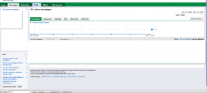
New Google Adwords Interface:: Good or Bad?
Google never seems to stop recreating and advancing its user’s online experience. The new Google Adwords interface is just one way of confirming this statement. But was it really for a better use?
I have not looked deeply into the software but i navigated the menu and so far there seems to be no new feature.
So what is the intended good?:
1-tab browsing, which eliminates page reloading when choosing new options. Also an easier way to switch between campaigns, ad variations, settings and keywords.
2-Drop down menus that compacts the bulky, unattractive and primitive menu.
3- A Grayish footer that supposed to add some flavor to the software.
4-On hand help section located on the bottom left.
What is the unintended bad?:
1-still a non attractive design. It is surely important to sacrifice design for the sake a faster, high trafficked software but people tend to react and interact better with icons and graphics, even if minimal.
Also the fact that Google tried to conserve a lot of what the user originally used, and avoid confusion, they stuck to the older interface so much that at times you cannot differentiate:

2-The user will have to relearn how to access certain options that he originally spent time learning.
3-It is in Beta testing, so i feel skeptical trusting it managing my money, thus if i choose to use it i would have to monitor it closely and report back to Google if any error occurs. Which means not only that Google is making money of me, i am indirectly working for them!
The bottom line of this is that it is not our choice. Google controls the online targeted ad industry, especially after acquiring DoubleClick.com. Even if it meant an ugly interface with green header menu and expensive keywords!!!

Leave a Reply
You must be logged in to post a comment.